Refreshing the digital experience for an authorized Coca-Cola bottler
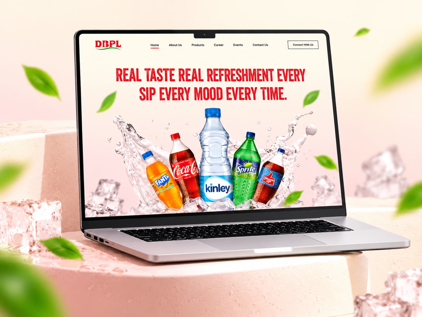
Diamond Beverages Pvt. Ltd. (DBPL) is one of Eastern India's premier authorized bottling and manufacturing franchise partners for The Coca-Cola Company. The project centered on crafting a vibrant, high-energy digital brand presence in Figma that captures Coca-Cola's iconic refreshment while giving distributors, retail partners, and career applicants seamless access to vital business portals.
Results & Impact
The component-driven Figma prototype delivered a scalable design system, tactile beverage showcases, and intuitive inquiry funnels that elevate DBPL from an industrial manufacturer into an engaging digital brand.
As an authorized bottler producing beloved beverages like Coca-Cola, Thums Up, Sprite, Fanta, and Kinley across Eastern India, DBPL operates massive bottling facilities and distribution networks. Yet their digital presence required a contemporary overhaul to match the refreshing vitality of the world's most recognizable beverages while serving industrial B2B partners and prospective talent.
The Challenge
DBPL operates at the intersection of two very different worlds: the high-octane consumer excitement of Coca-Cola's beverage portfolio, and the operational precision of industrial bottling plants, supply chains, and distributor logistics.
The primary challenge was harmonizing these two personas. Distributors, retail vendors, and job candidates visiting the site needed clear, frictionless access to business tools and contact channels, while consumers and brand enthusiasts needed to immediately feel the crisp, ice-cold refreshment that defines the Coca-Cola brand family.
- Deliver immediate sensory impact through bold typography, ice splashes, and condensation visuals
- Streamline paths for retail partnerships, dealership inquiries, and manufacturing careers
- Establish an organized Figma component library utilizing auto-layout, design tokens, and interactive prototype states
Design System & Color Palette
A vibrant and refreshing color palette inspired by the joy of beverages. The colors reflect energy, refreshment, and a clean modern brand look while maintaining accessibility across digital touchpoints.
The primary Coca-Cola red and deep burgundy anchor critical interactive triggers, while the warm ivory and neutral grays provide generous breathing room for product catalogues and corporate disclosures.
Coca-Cola Red
Primary brand color used for key actions, highlights, and brand elements.
Deep Burgundy
Used for headers, sections, and strong visual elements.
Warm Ivory
Background color for a clean and premium look.
Dark
Used for text, headings, and important content.
Accent Yellow
Used for highlights, badges, icons and accents.
Visual Identity & Sensory Design
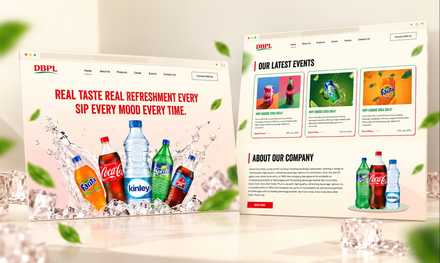
The visual identity embraces a thirst-quenching aesthetic: crisp product staging on glistening ice pedestals with dynamic water splashes and floating mint leaves that convey instant refreshment and premium quality.
The typography pairs punchy, high-impact condensed headlines ('REAL TASTE REAL REFRESHMENT') with legible, spacious navigation and body copy. This allows the distinct brand colors of Coca-Cola red, Sprite green, Fanta orange, and Kinley blue to stand out without competing with one another.
Figma Prototyping & Micro-interactions
Built entirely in Figma using auto-layout 5.0 and nested interactive components, the prototype simulates an authentic, production-grade browsing experience.
Smooth hover transitions, interactive dropdown navigation, and responsive card behaviors provide stakeholders and developers with an exact blueprint for the live web application.